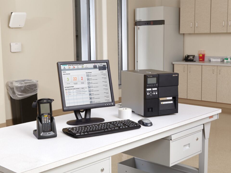
Challenge : a confusing navigation system
I was brought on to the relaunch of the syngo® Lab Inventory Manager by its product manager. He had feedback from customers complaining about the use of the software. After analysis of the UI, a few points were key to improving the ease of use.
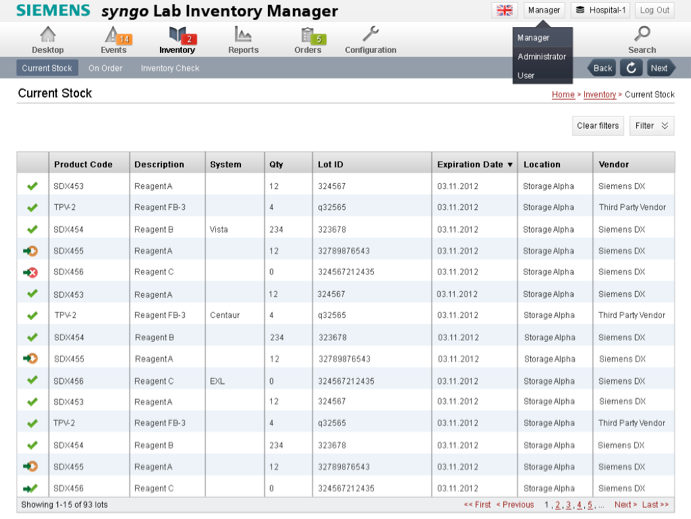
Original syngo® Lab Inventory Manager screens
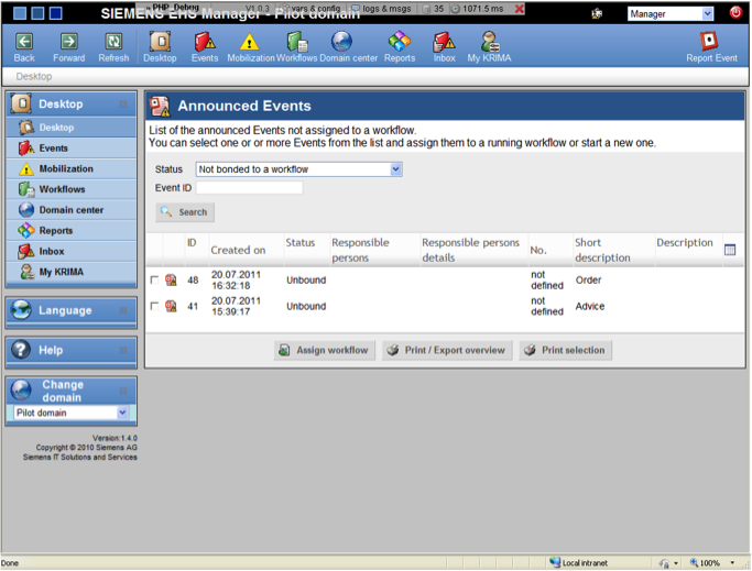
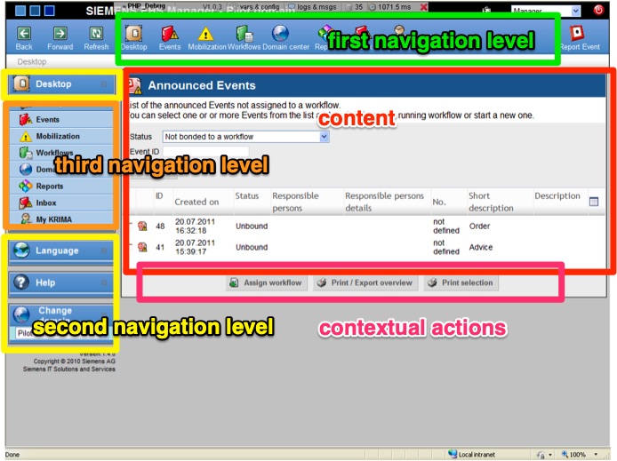
The navigation was confusing for users and occupied too much horizontal screen real estate which prevented users from being able to see more from the content lists.
The contextual content buttons constantly shifted locations on the screen as they were trailing under the list of content irritating users.
The solution
I participated in requirement gathering sessions with stakeholders : district sales managers touring the world to distribute the product who had relayed the customers frustration with the software. Our goal was to refine the syngo Lab Inventory Manager software's high level product definition and create an updated information architecture.
I hosted a card sorting exercise to streamline the navigation from 3 levels to 2 levels only.
From the initial UI analysis and the card sorting workshop, I created high level wireframes for the product and an updated look & feel.
By re-organizing the information architecture and menu navigation, I was able to create an easier to use navigation.
Redesigned syngo® Lab Inventory Manager screens
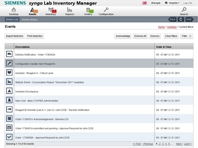
syngo® Lab Inventory Manager has since then been rebranded but still uses the original information architecture and assets I created.
