
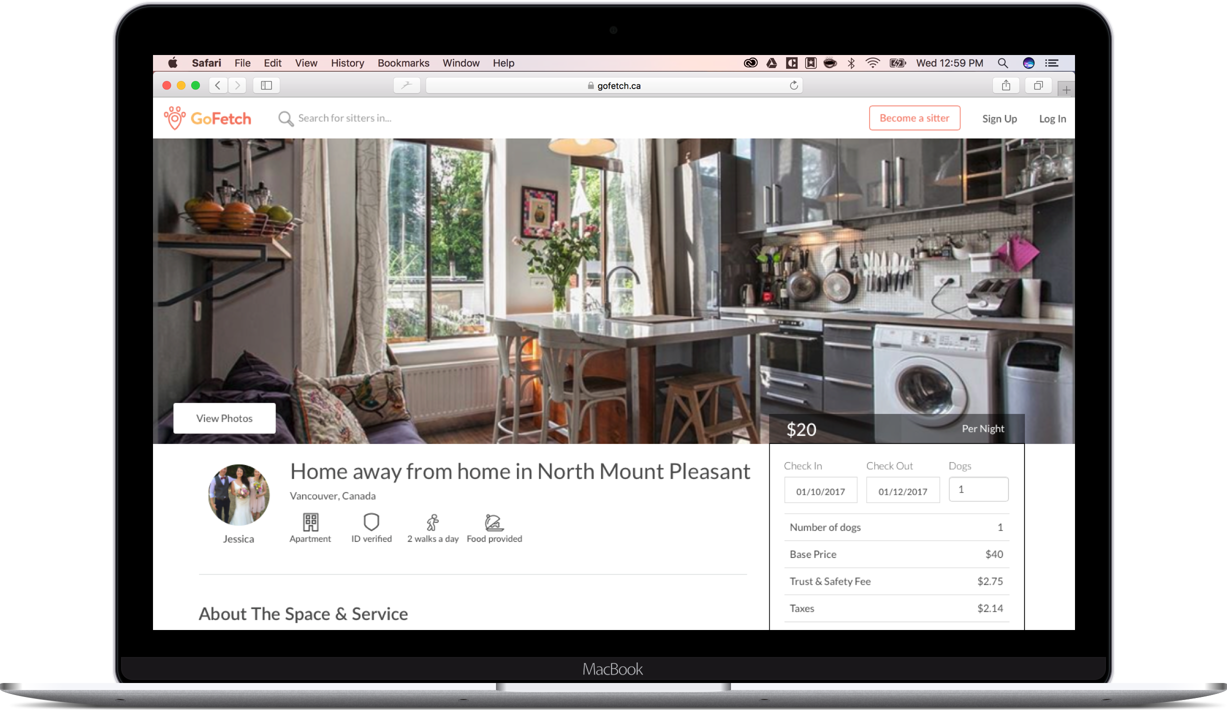
GoFetch.ca had launched originally as an iOS app that only offered dog walking. At the end of 2016, the cofounders decided to kick-start a larger online business offering peer to peer dog boarding by copying Airbnb’s circa 2016 website. Airbnb’s design is focused on showcasing interior spaces and the pet care domain knowledge did not map well to the service provider application process and profile pages.
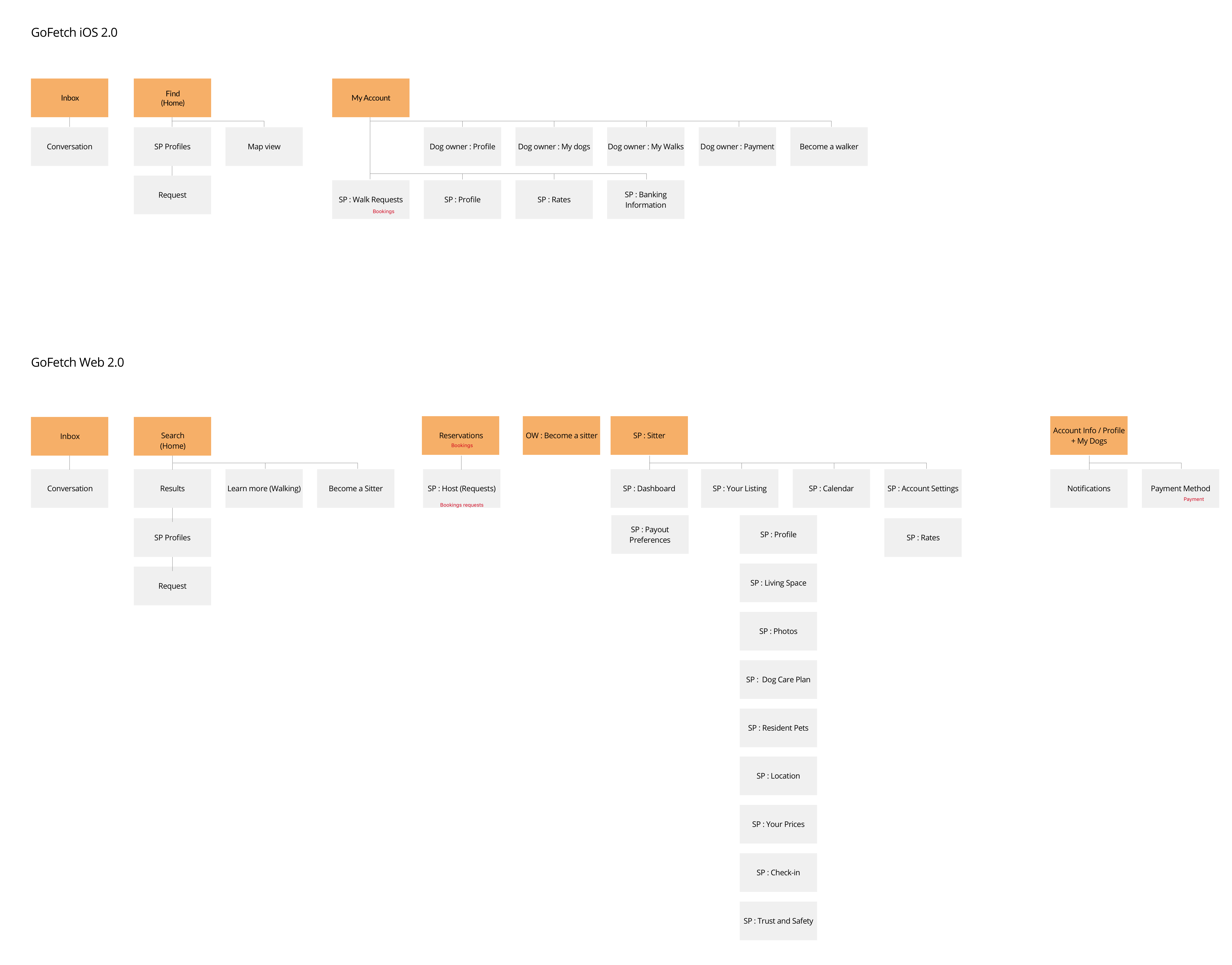
The web platform did not use the same structure nor labels as the original iOS app creating confusion for users.
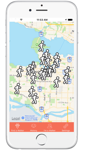
Initial iOS homepage offering only walking
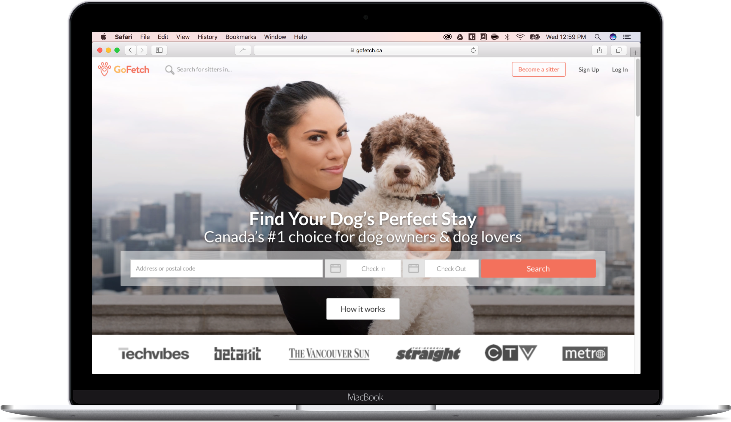
Initial Website home page offering only boarding
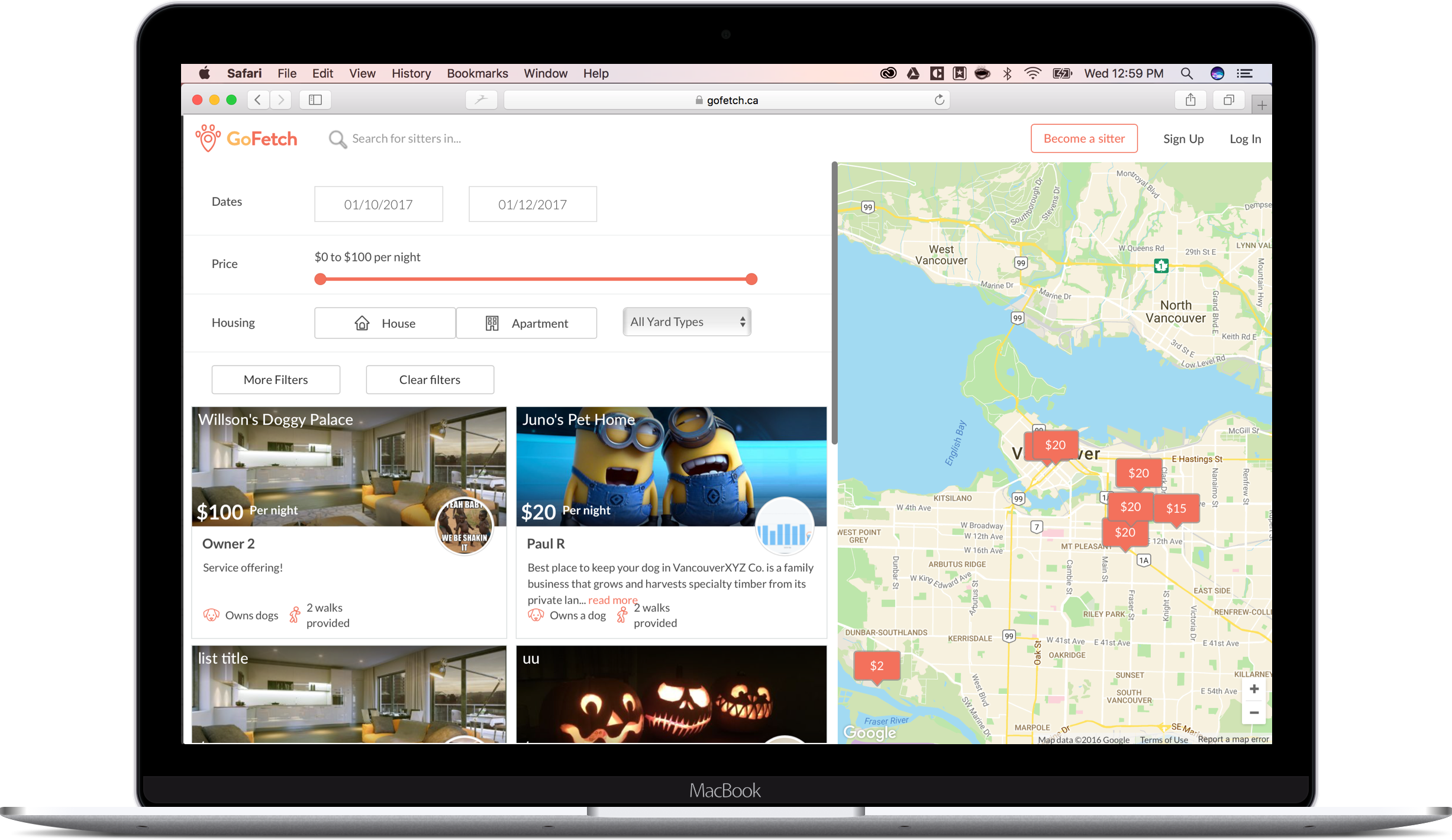
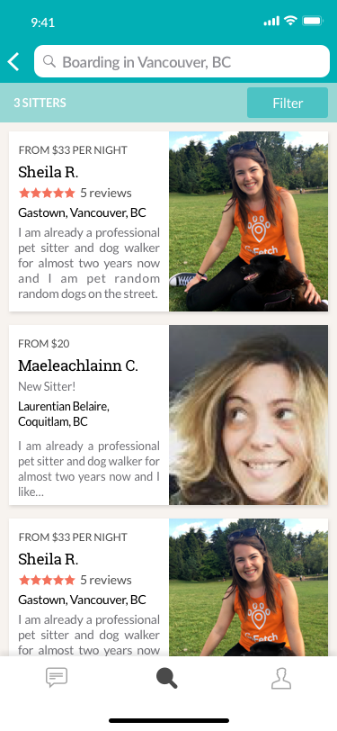
Initial Website search page
Initial Website sitter page
Initial iOS and web sitemap comparizon
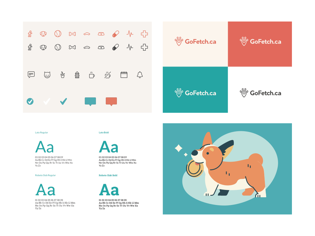
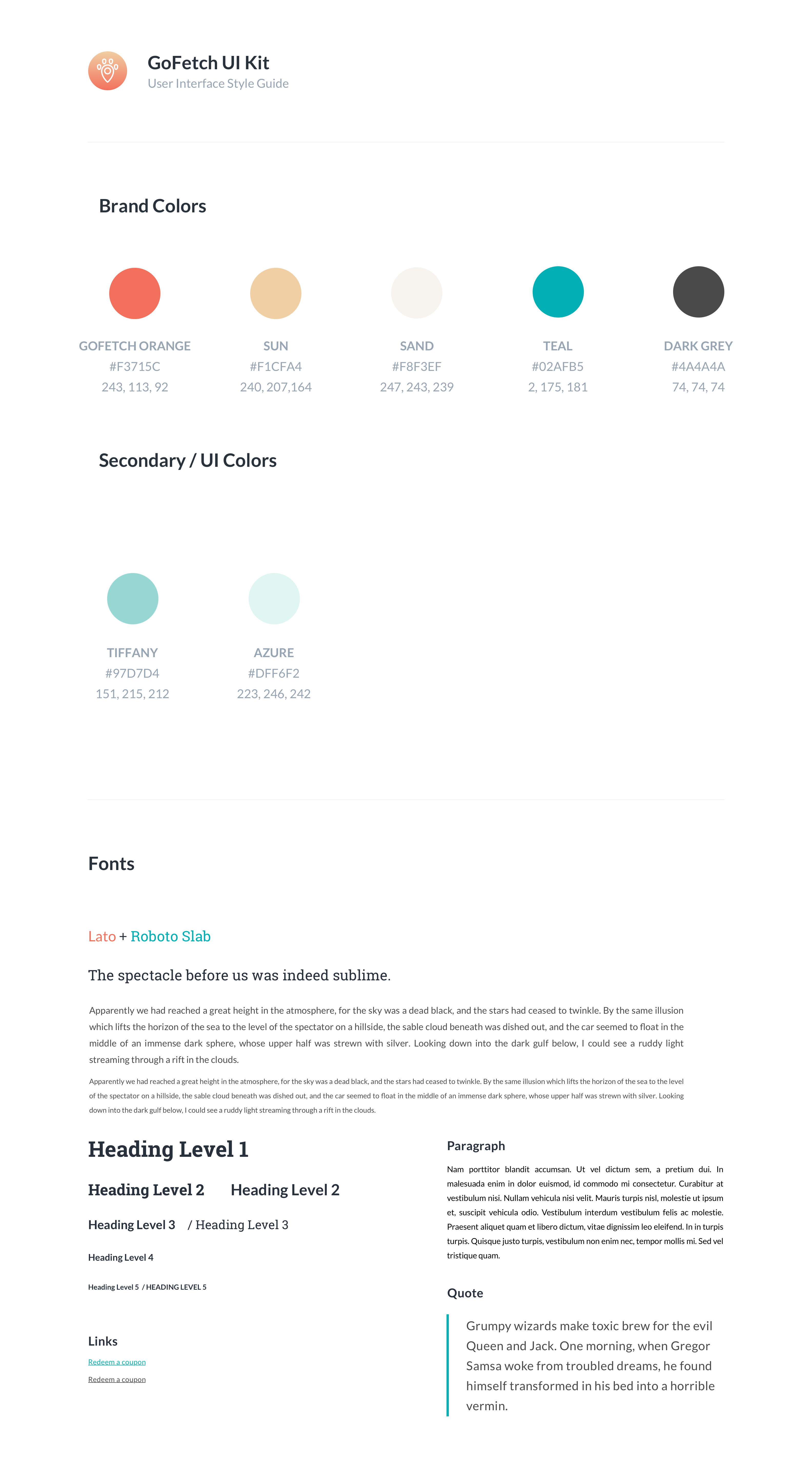
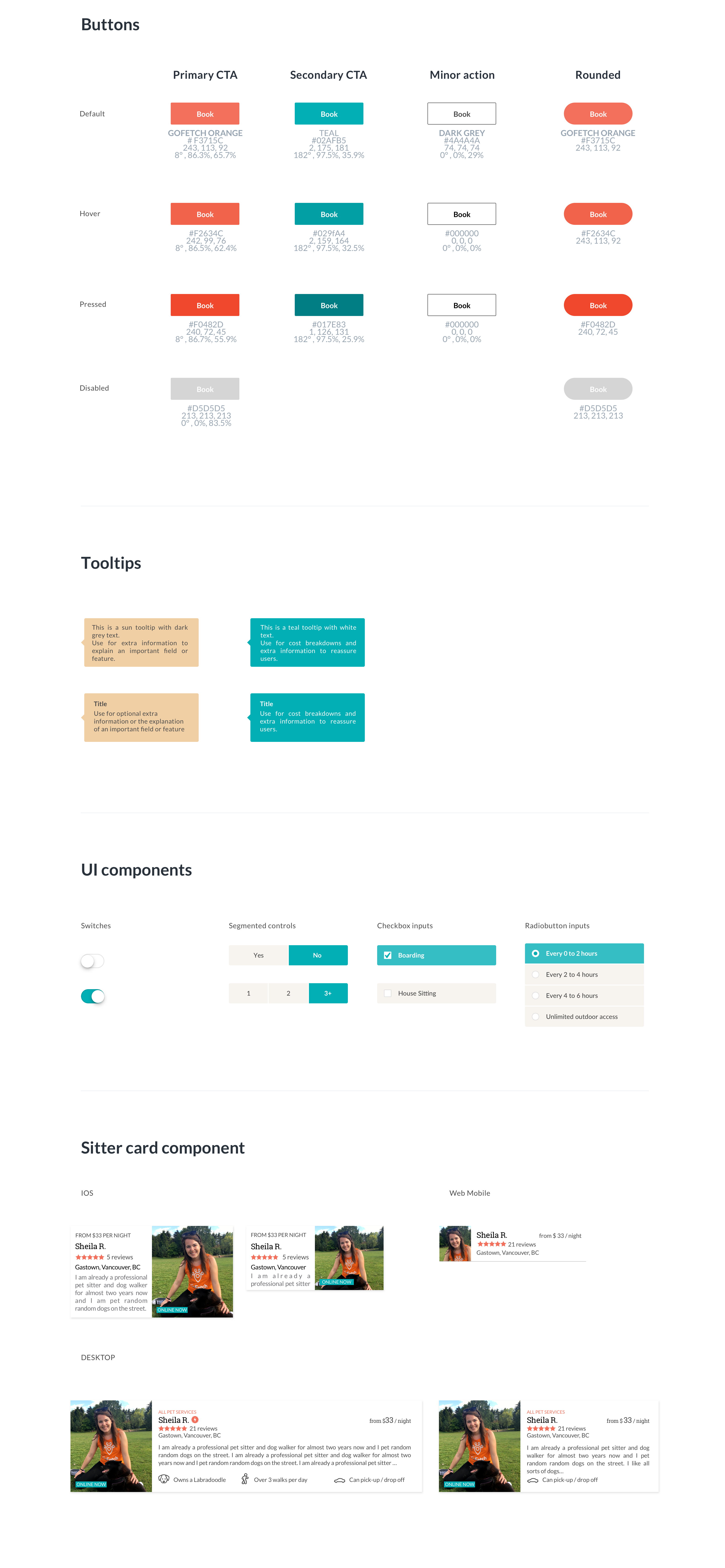
To establish a consistent brand experience and language, I created a brand and design system to be used across both platforms, iOS and Web.
New brand and design system
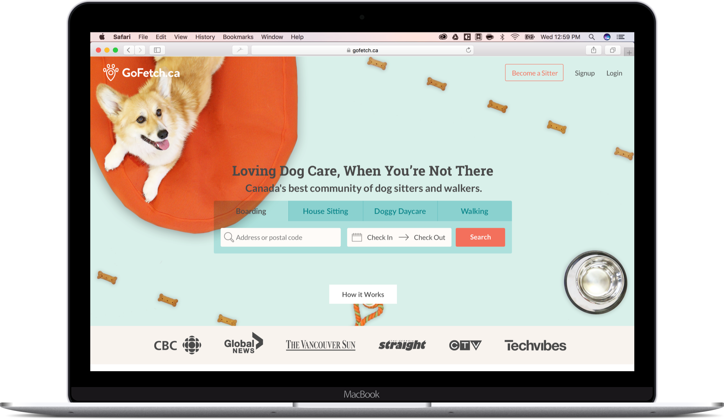
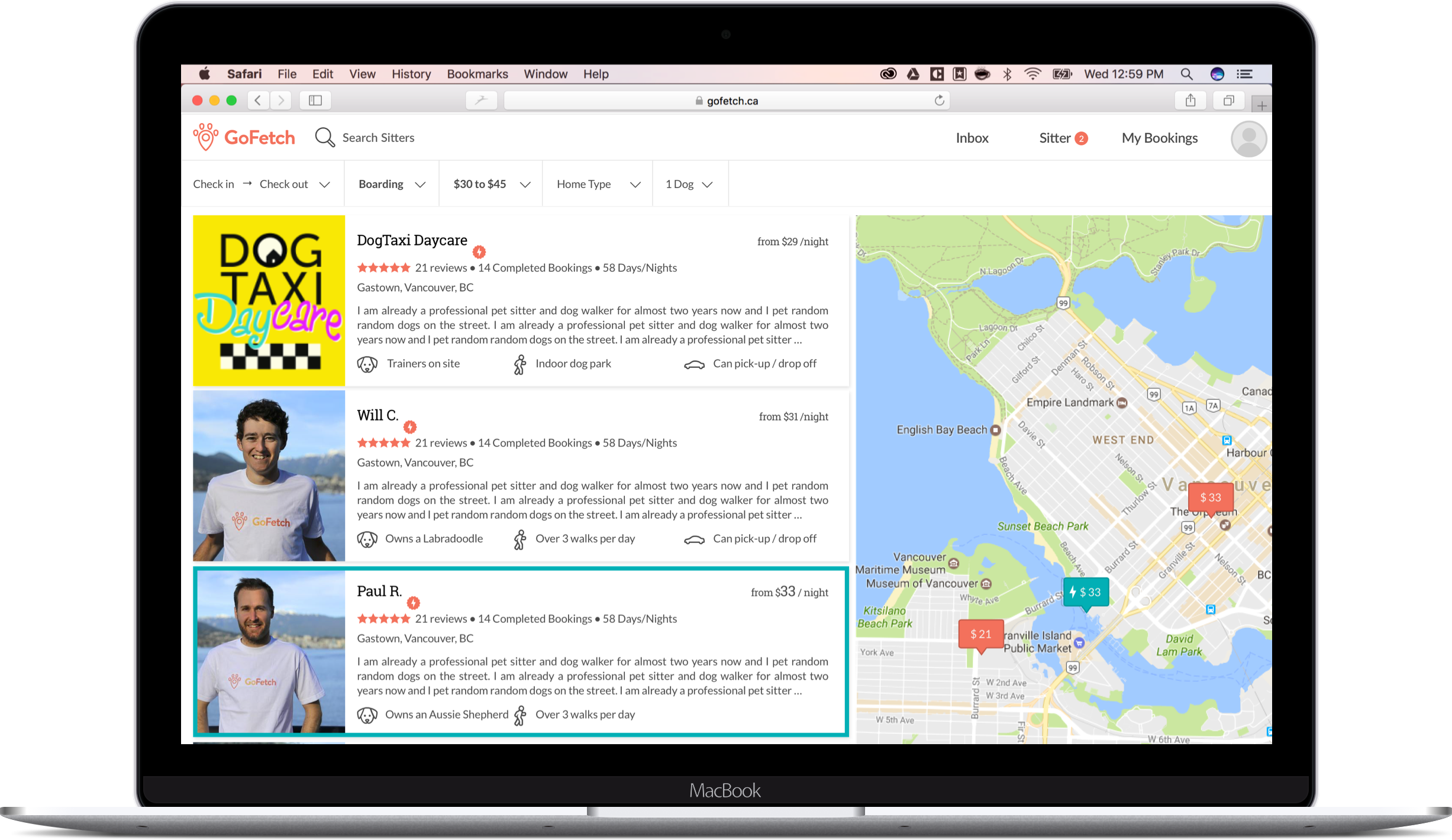
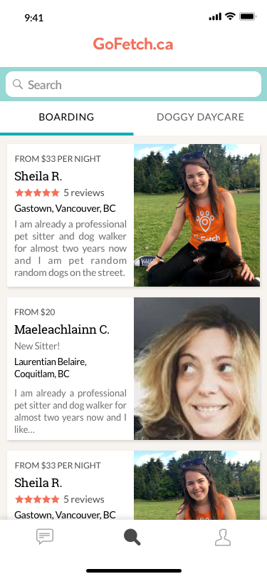
By mapping out the information architecture, the inconsistencies stood out. I leveraged this to redesign the GoFetch IOS application and website into their second version, to diversify the service offering and create a unified experience and set of offerings across all platforms. The different service offerings (walks, boarding, doggy daycare) are available as tabs in both platforms’ home page.
Redesigned Web homepage
Redesigned Web search page
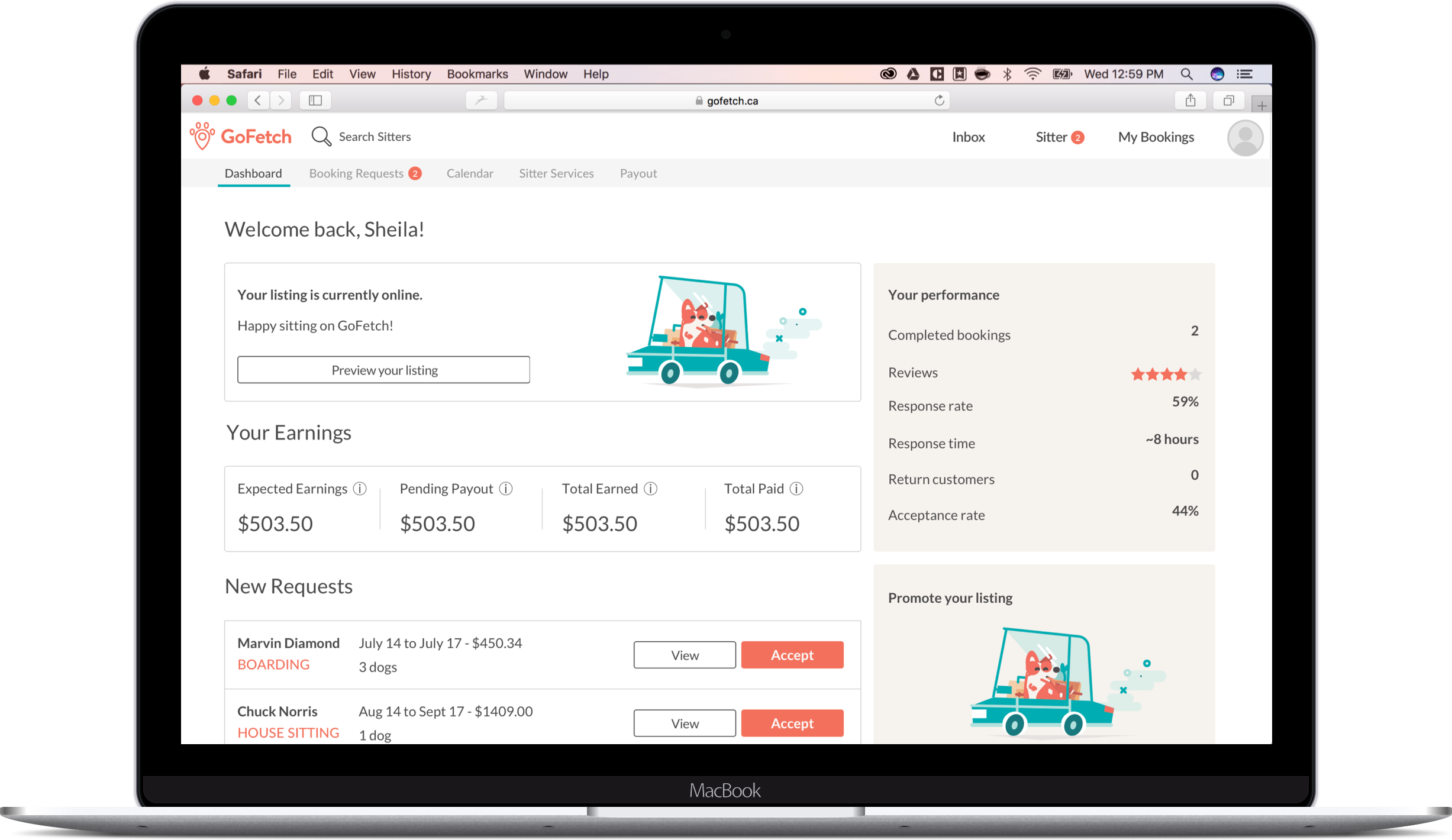
Redesigned Sitter Dashboard
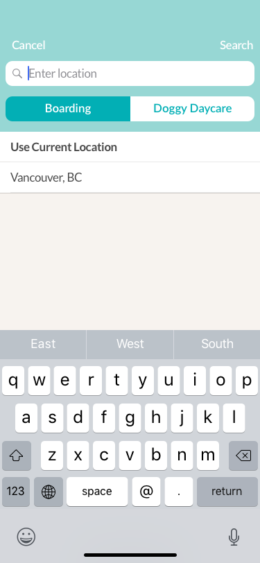
Redesigned iOS home and search component
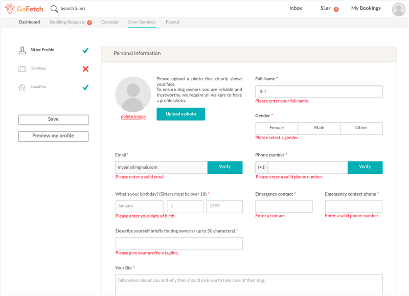
At launch, the original sitter application process only converted 6% of total potential applicants into pet sitters hindering growth of the platform.
260 sitters enrolled only out of a goal of 750
1394 potential sitters had incomplete sitter profiles
We registered all users that accessed the profile description page as “incomplete sitters”.
Users complained about not being able to save because of errors out of the current page & hard to fill inputs.
Initial sitter application form
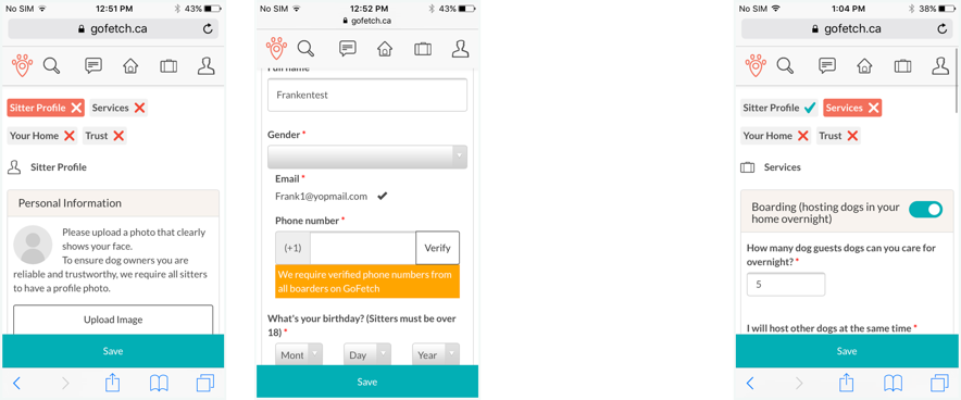
I looked at the sitter application process through Google Analytics and found out a large number of potential applicants viewed the sitter application process on mobile resolutions. The sitter application process was not built for mobile resolutions and very difficult to complete.
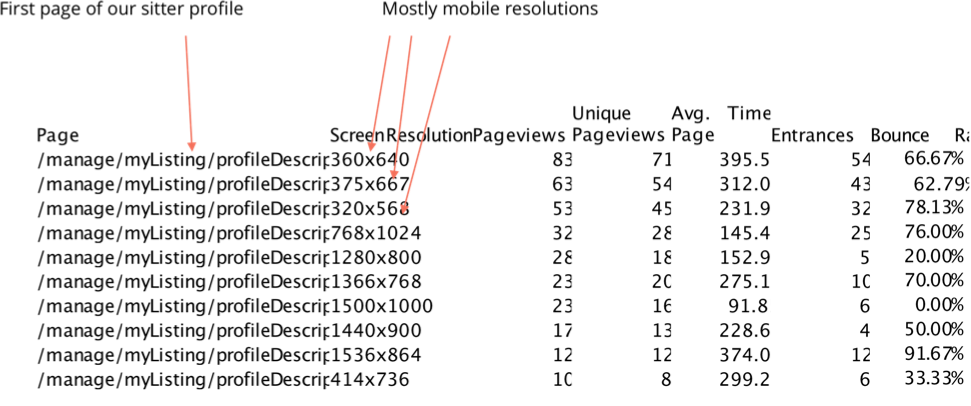
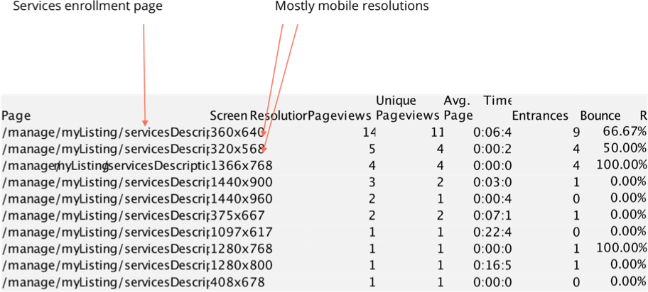
First page of the initial sitter profile and services enrollment page on a 320*568px browser resolution
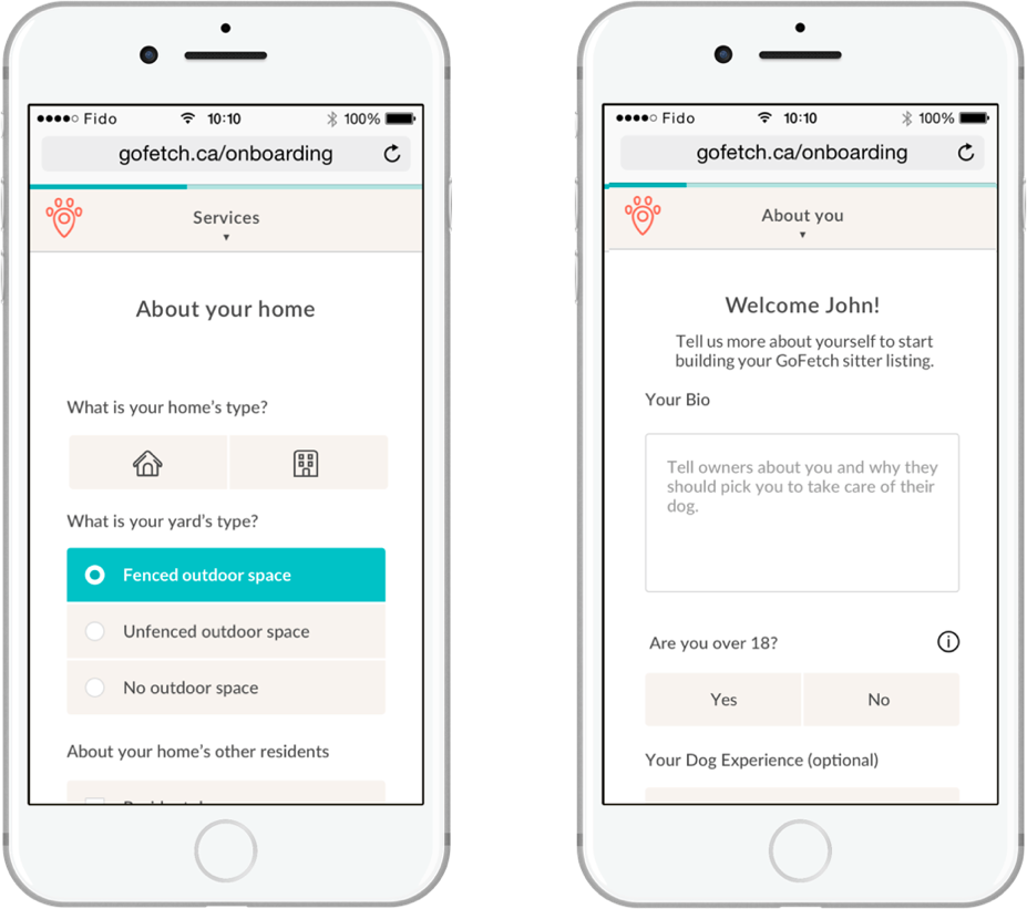
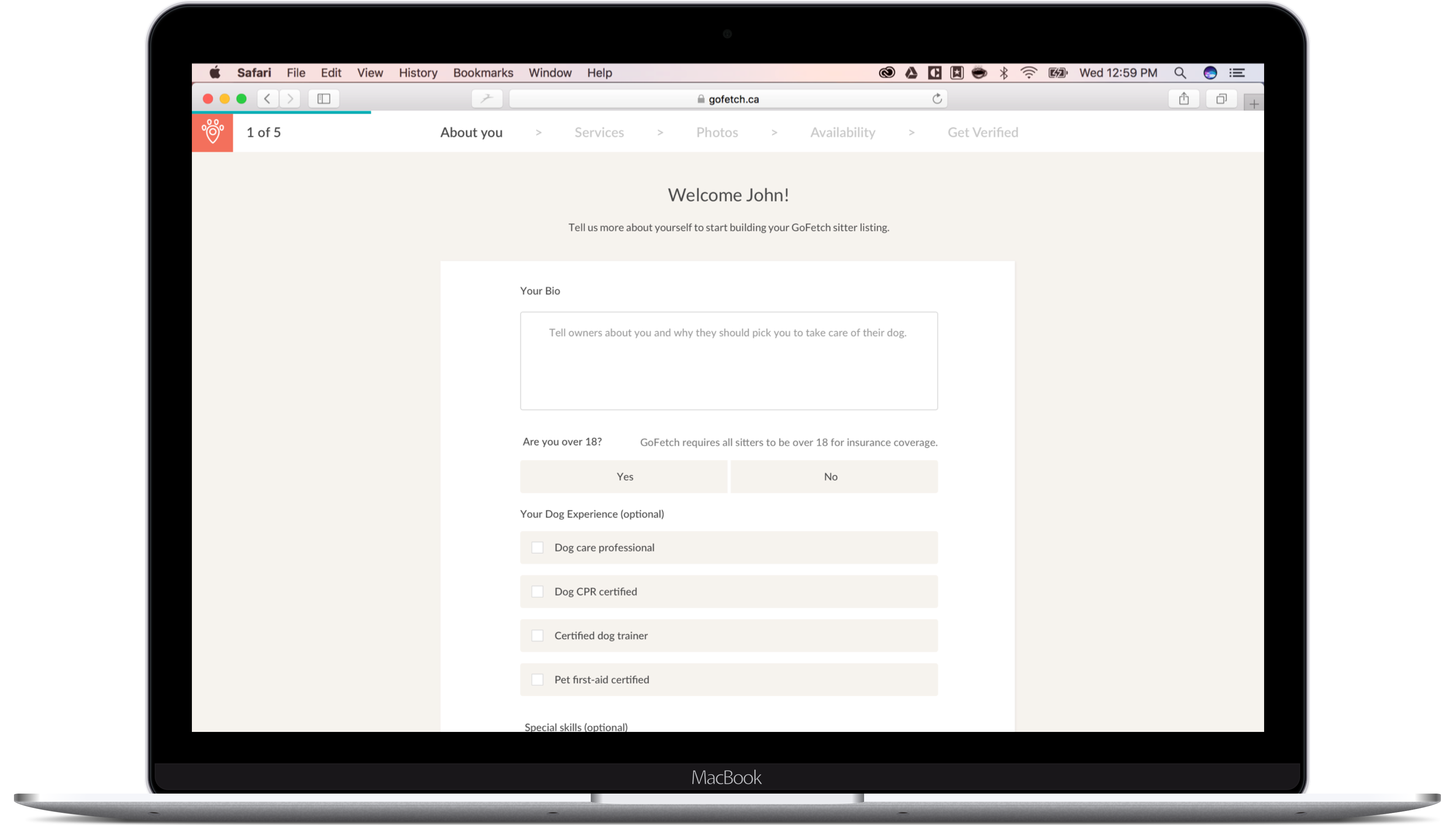
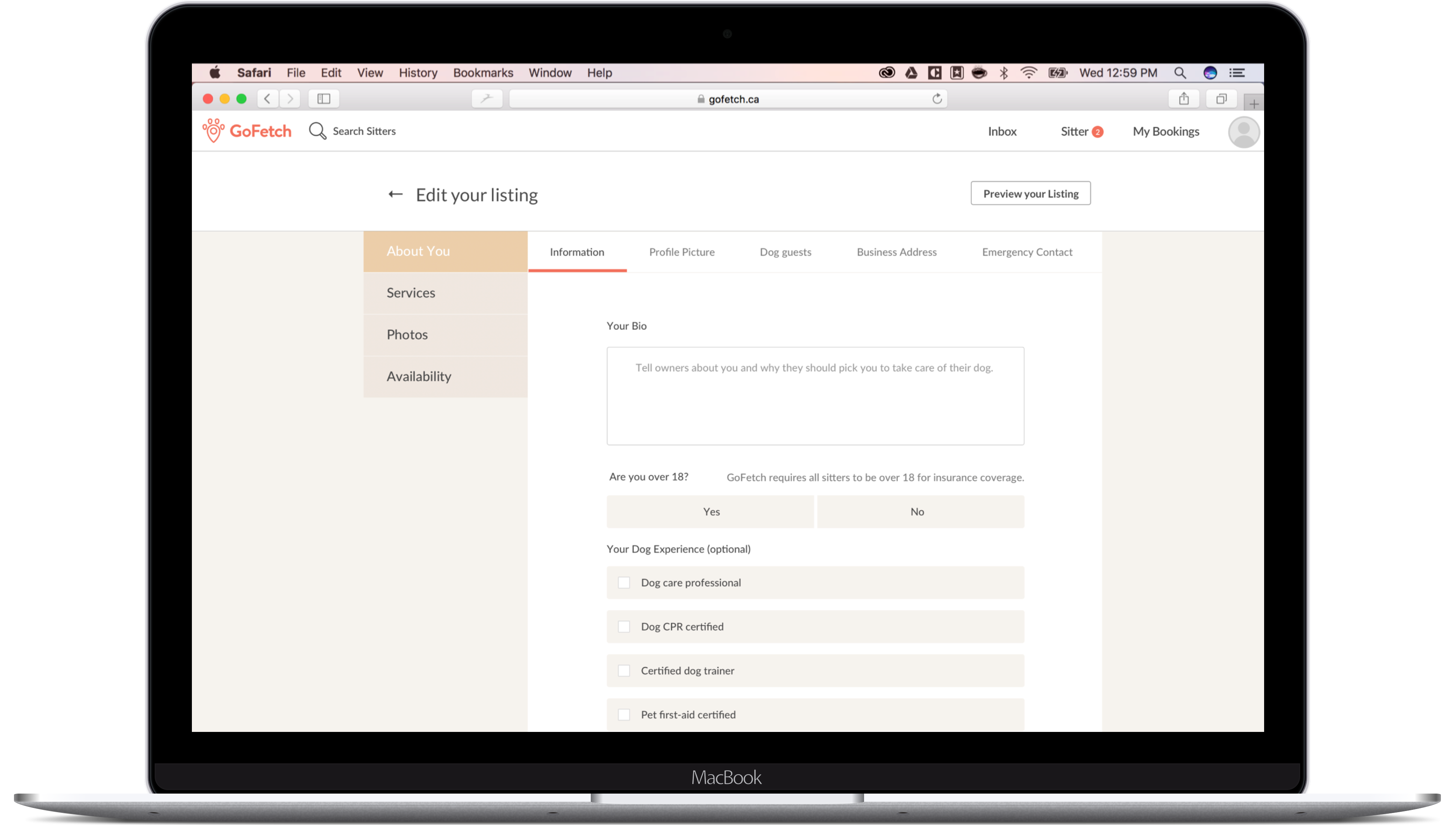
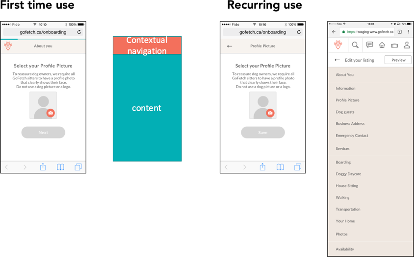
Creating mobile-first UI components & wrapping the form with two separate navigations: a wizard for the first time use and a two-level navigation for recurring use.
The wizard requiring per-page validation.
Redesigned sitter application logic and navigation
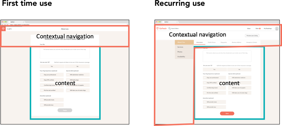
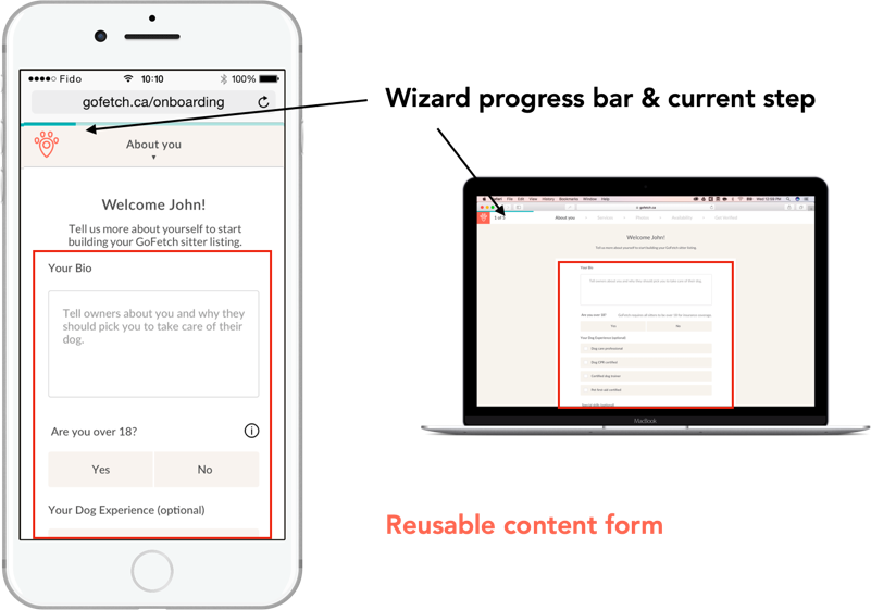
By redesigning the application flow to be a wizard, using standardized web components and facilitating error recovery, the conversion rate from potential sitter applicants to submitted profile was doubled (6% to 12%).
Redesigned sitter application pages
